Enter password to view case study
Framing a creative production studio
Client
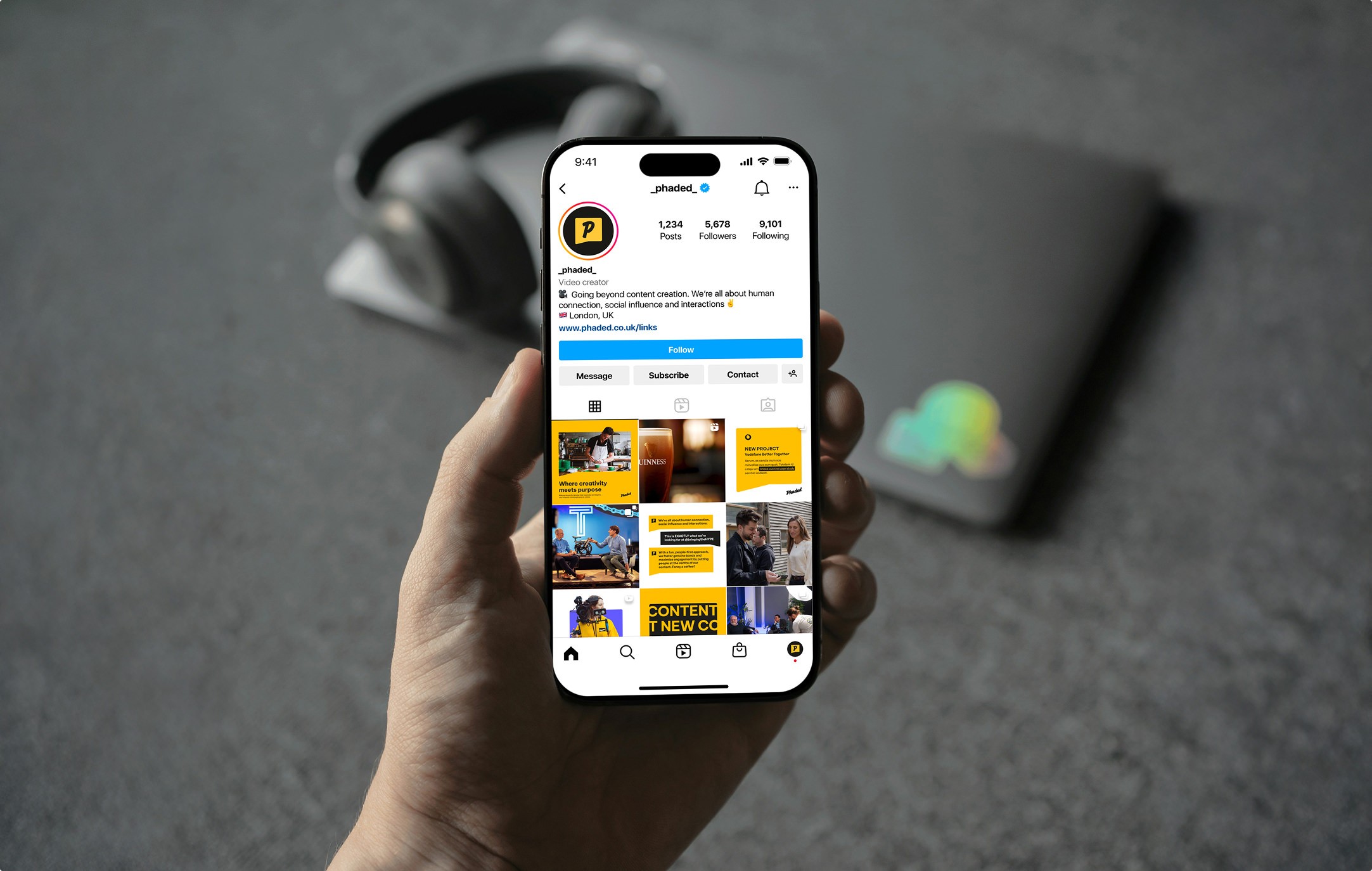
Phaded
Sector
Production Studio
The job of a production house isn't to show off. It's to frame the client and give the agency credibility. Phaded needed a brand that did the same.
Brand Strategy
Visual Identity
Style Guide
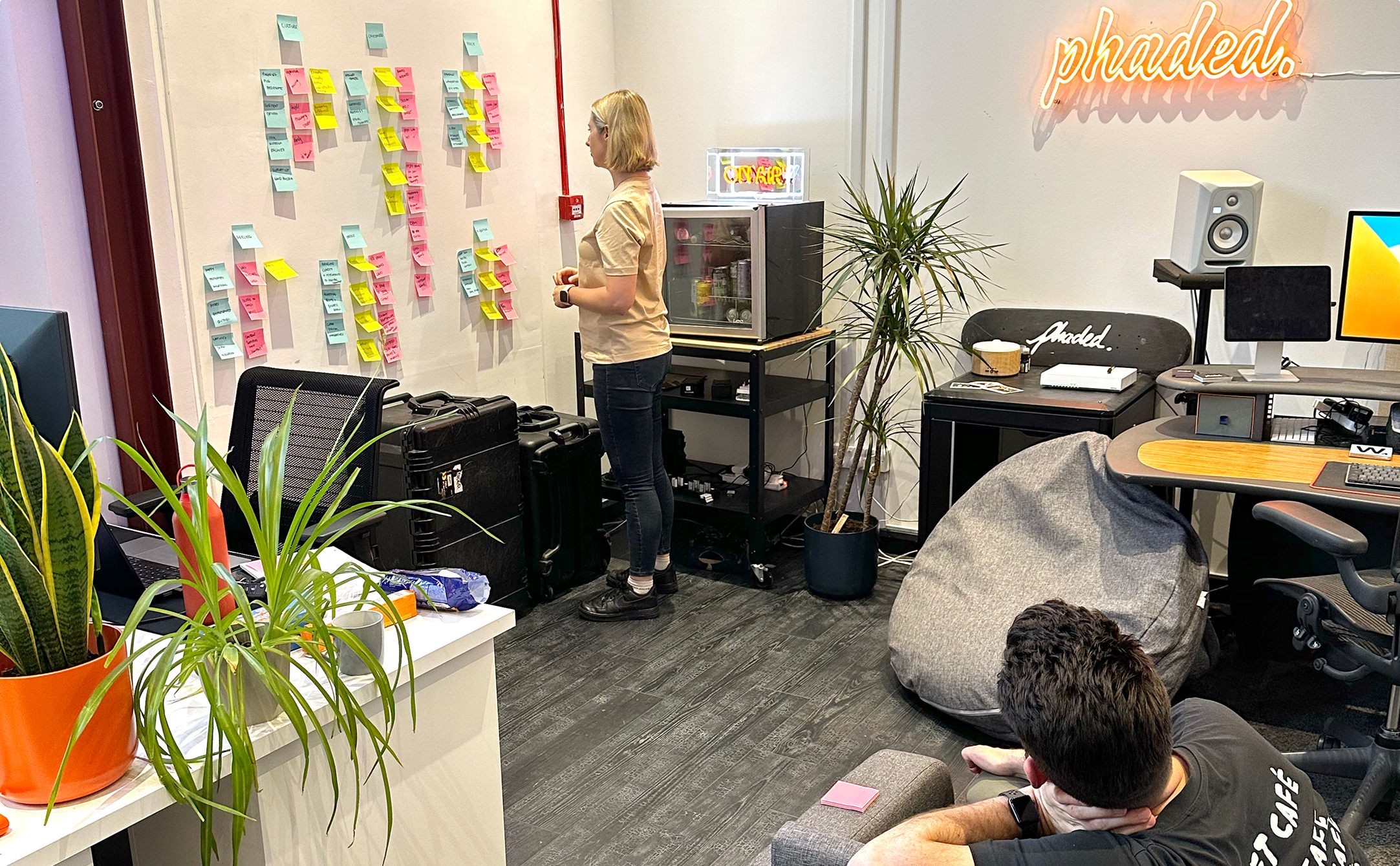
Phoebe Bullock and Will Entwistle have been running Phaded since 2015. A decade of work for agencies and brands like Vodafone. A reputation built on narrative-led video, social-first storytelling, and the kind of reliability that makes agency producers sleep at night.
The substance was there. The brand wasn't keeping up.
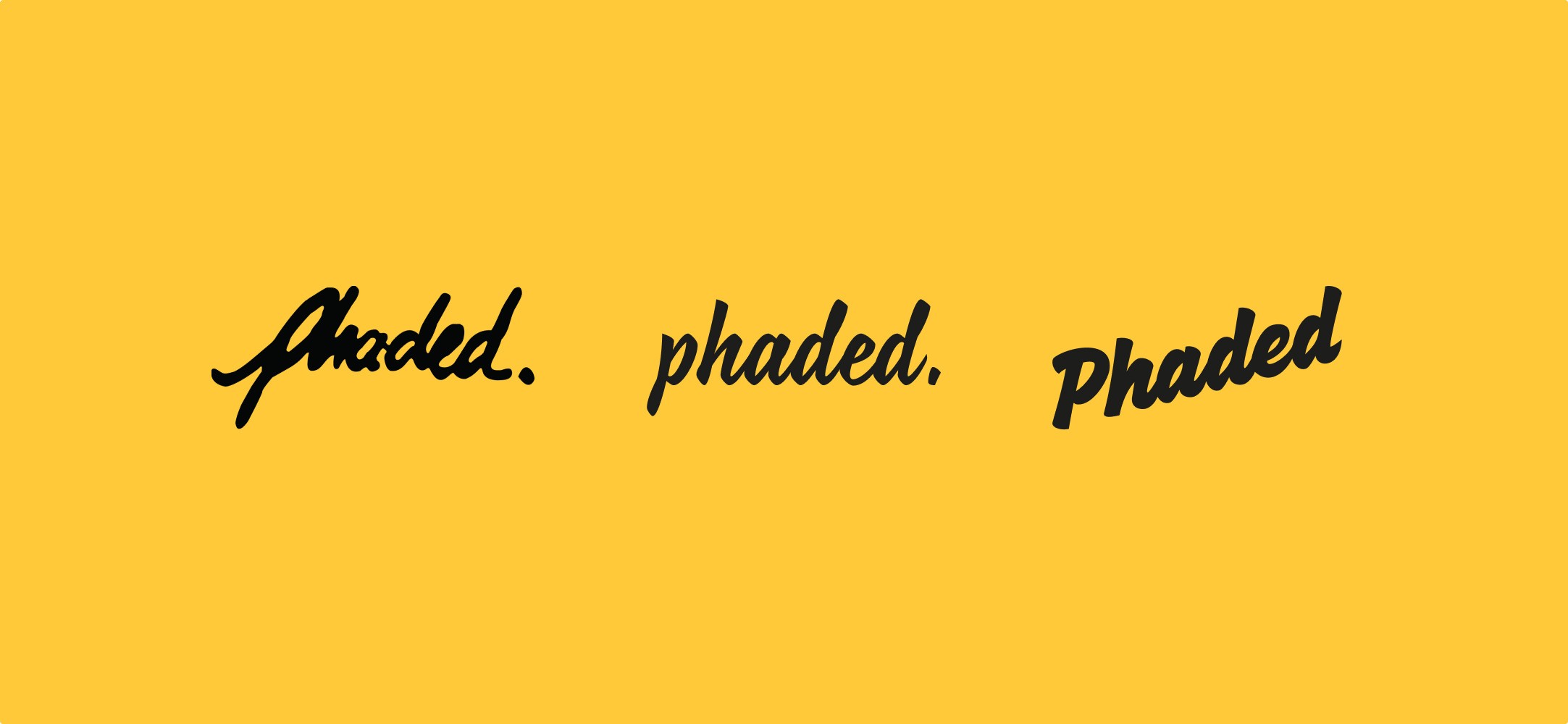
Will had hand-drawn the original Phaded wordmark in 2015, and it had served them well in the years it needed to. But by the time Phoebe got in touch, the mark had become the wrong kind of signal. It read young. The work didn't. When Phaded showed up next to the studios they were now competing with, the visual identity made them look like the new kid in a room they'd been working in for ten years.
It wasn't a question of equity. They knew the old mark didn't carry value they had to protect. They could have walked away from it cleanly. The brief was the opposite: keep the hand-drawn lineage, build on it, evolve it into something that could actually carry the weight of the work and the relationships behind it.
The trigger wasn't a single moment. It was the quiet accumulation of pitch decks, agency conversations, and client introductions where Phoebe and Will were having to explain who they were rather than show up already established. Established in substance. Not yet established in brand.
The production category is loud. Fancy visuals. Overstretched claims for creativity. Studios pushing every showreel as if the showreel is the product. The default move is to make the studio the centre of the story.
That's the wrong job. The job of a production house is to remove risk for the agency and the end client. To deliver a predictable, proven, reliable output every time. To frame the client well, make the agency look good in front of them, and quietly become the partner that gets called back. Reputation compounds that way. Showmanship doesn't.
Phaded sit in the social-first end of the market. Modern category, fast-moving, full of studios chasing the latest trend or aesthetic. Phaded's position is the opposite: not constrained by what's currently in fashion, but not stuck in it either. Honest narratives. Human storytelling. Real connection between brands and audiences. The work is genuinely creative when the brief calls for it, but creativity isn't the pitch. Reliability is.
The lie the category tells is that production studios win work by looking the most exciting. The truth is they win work by being the safest pair of hands in the room while still producing content that earns its place on someone's feed. Agencies don't pick partners on flair. They pick on whether they trust them in front of their client.
That gap, between a category obsessed with showing off and a job that's fundamentally about giving credibility to other people, is where Phaded's brand had to land.
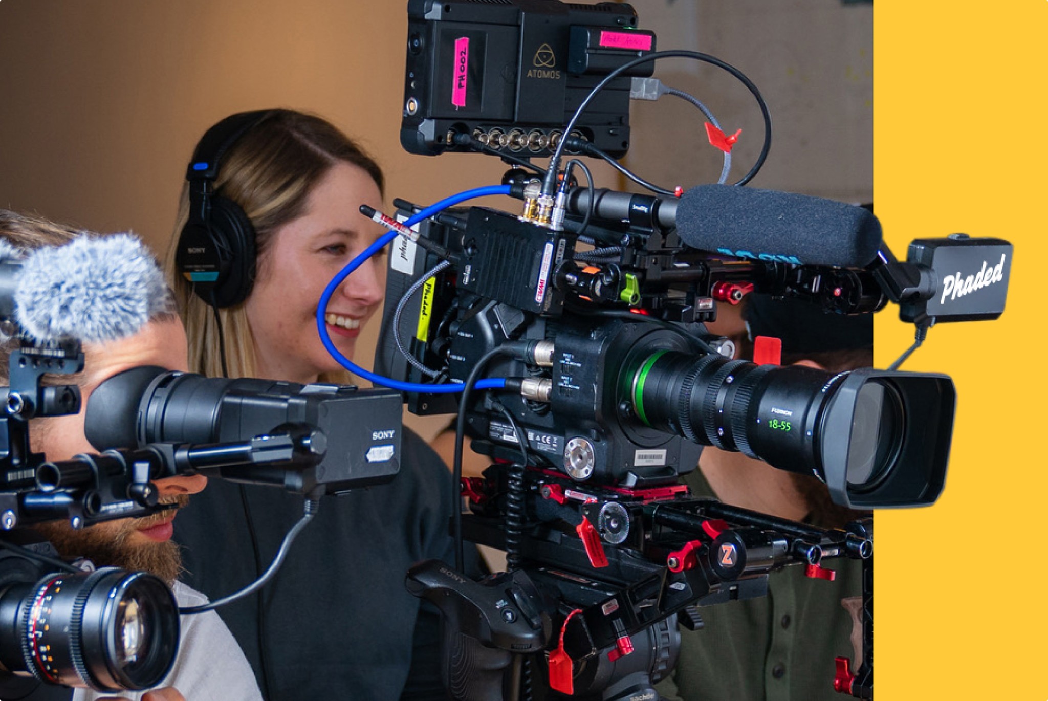
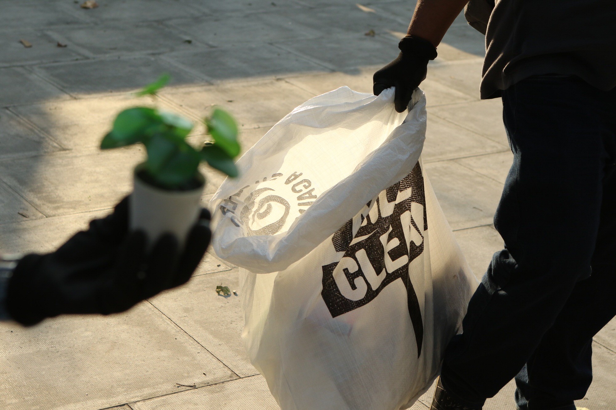
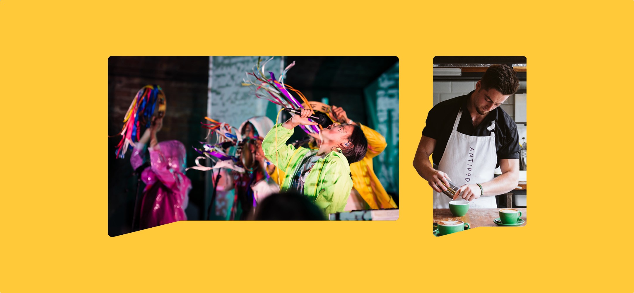
Photography by Dan Bissill at Phaded
The Identity
Every visual decision had to argue for credibility, craft, and ownership of a brand that doesn't need to shout because the work already does the talking.
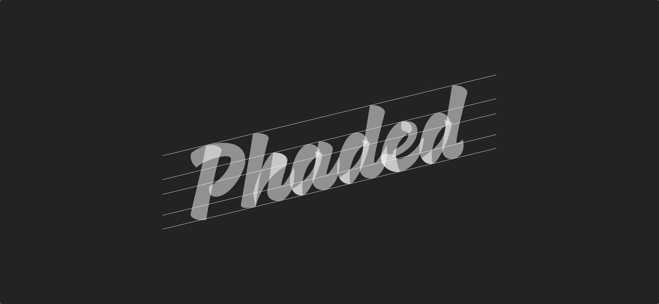
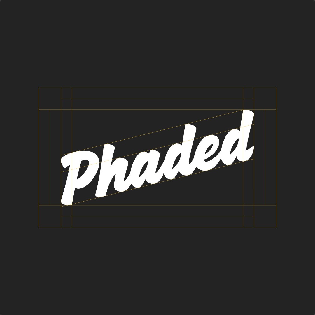
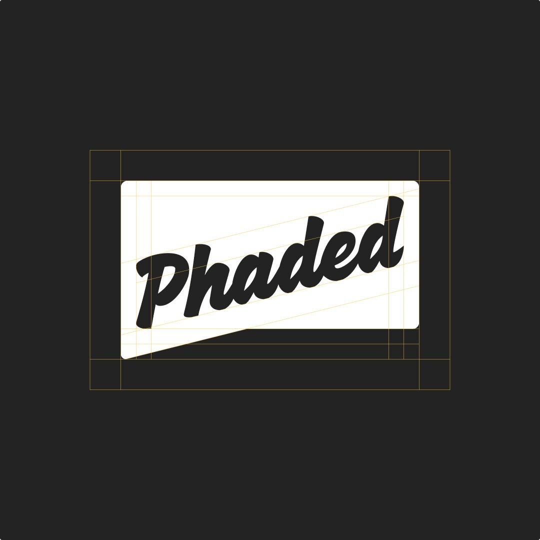
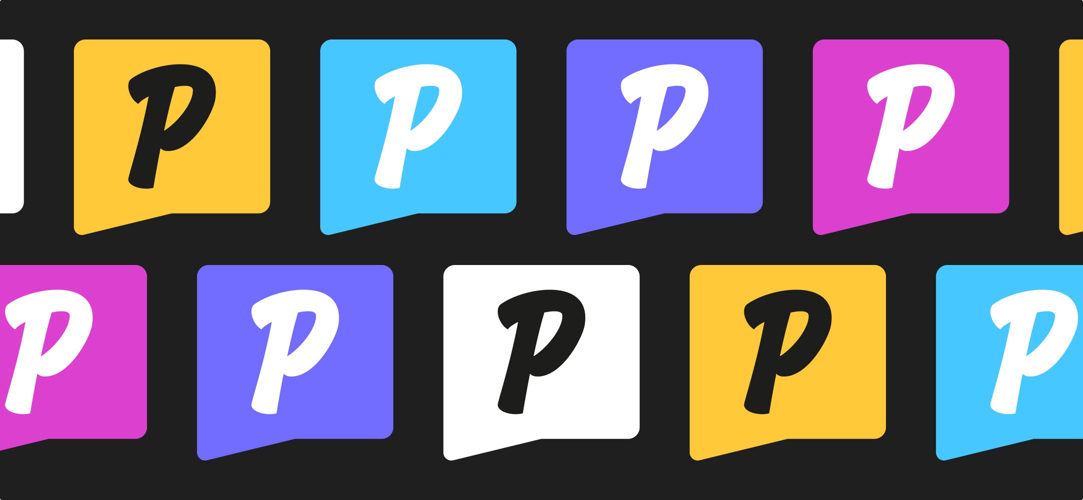
The custom hand-drawn wordmark. The new Phaded wordmark is bespoke, slightly script-led, hand-drawn and refined for digital. It evolves Will's original 2015 mark rather than replacing it. That continuity is doing strategic work in two directions at once. It honours a decade of receipts, which is the heritage signal the brand needed. And because it's custom and not built on a typeface anyone else could licence, the mark itself is a proof of craft. A studio that obsesses over its own wordmark is a studio that will obsess over the client's frame too. The logo is the first piece of work in the portfolio.
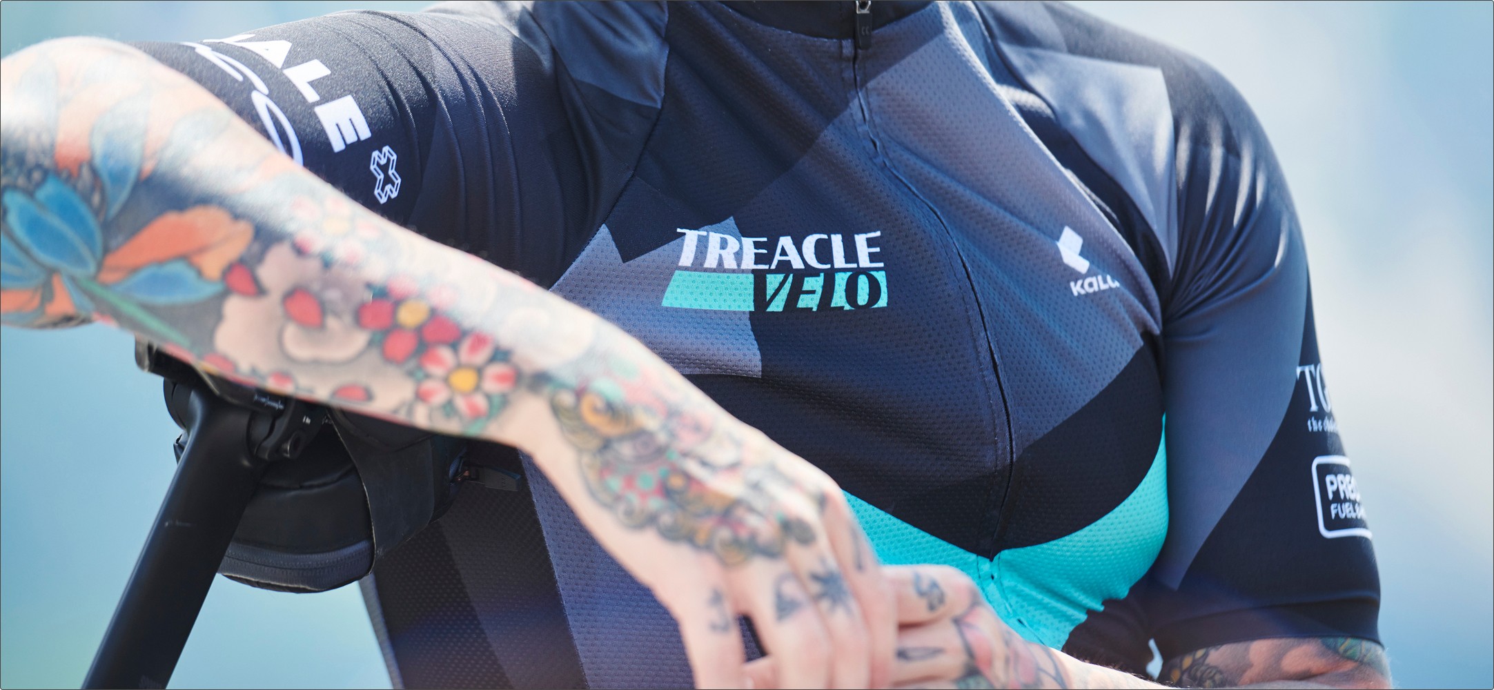
Yellow as the primary brand colour. Yellow (#FFC93A) anchors the system, with black and white doing the structural work and a secondary palette of blue, purple and pink available when the brand needs to flex. Yellow is confident without being aggressive. It carries warmth and attention at once, which is the brand's actual job in front of an agency: be visible, be approachable, don't be threatening. A more conservative palette would have undersold the social-first energy. A louder palette would have pulled the brand back into the showmanship trap the category's already drowning in.
The callout-frame badge. A flexible content frame that holds visuals across 16:9, stories, square, and Instagram-native formats. The badge isn't decorative. It's a system that lets Phaded's work sit inside Phaded's brand without ever competing with it. The frame stays consistent. What's inside it changes shot by shot, project by project. The brand becomes the trusted container around the creativity, which is exactly the relationship Phaded has with the clients they shoot for.
Be Vietnam Pro across the system. Modern, clean, neutral enough to let the wordmark and the frame carry the personality. Type that supports rather than performs. The hand-drawn mark needs a quiet typographic partner so the heritage signal stays where it belongs.
Voice that doesn't sell what the work already proves. Confident and approachable. Youthful and vibrant. Friendly and inclusive. Phaded talk like a partner, not a vendor pitching for the next gig. The voice exists to build relationships over time, not to win attention in a single line.
The System
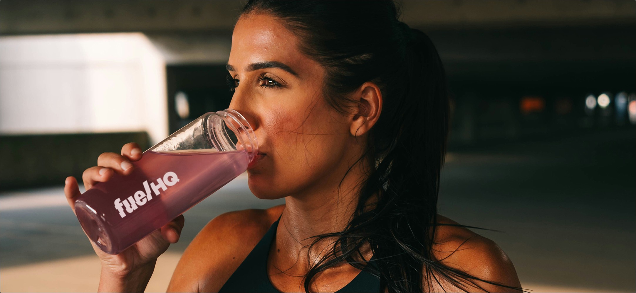
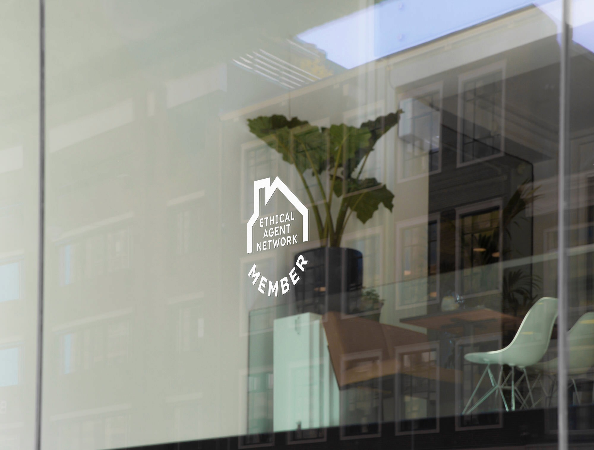
Phaded primarily sell to agencies, but they have direct client relationships that matter too. The brand system had to flex across both without diluting either. The same wordmark, frame and palette work whether Phaded are in an agency pitch or talking direct to a brand. Different audiences, same identity, no version of Phaded that contradicts another.
The asset library was built for the work Phoebe and Will actually do day to day. Logo files in every format. Social templates. Presentation decks ready for pitches. Brand guidelines documenting the system thoroughly enough that anyone they bring into the studio can use it without breaking it.
Flexibility was the standard. Usability was the test. The brand has to work in the moments it's actually used, not just on the front page of a website.
Brand strategy, including positioning, audience, market opportunity, and a roadmap for scaling brand equity over time. Visual identity, including the bespoke hand-drawn wordmark. Brand guidelines and full style guide. Logo file library across primary wordmark, secondary badge, and icon. Social media asset library. Presentation templates. Strategic roadmap mapping options against market risk, timeline and budget.
The deliverables matter less than what they unlock. A studio that's been quietly winning the work for a decade now showing up to win it openly.
A bespoke wordmark that proves the craft before a single frame is shot. A brand built to remove risk, not chase attention. The work is creative when it needs to be. The studio doesn't need to pitch that. The work pitches itself.