Enter password to view case study
Building a new legendary brand
Client
Black Unicorn PR
Sector
PR Agency
When you’re building a business, you don't stand out by being like everyone else.
Brand Strategy
Visual Identity
Creative Direction
Style Guide
Web Design
Development
The space between what journalists actually want and what PR agencies tend to deliver is wider than the industry wants you to believe. And unfortunately, founders often pay for placements that don't produce the results they want.
Black Unicorn PR is an agency built by a team that understands both sides of the relationship, working with founders who need something more substantial than coverage. Together, Julija and Mauro built an agency to prove that great PR is great journalism applied to a brand's story and not a transactional service measured in impressions and clicks.
Across the category, PR offers the same promise: “We'll get you in TechCrunch”. Offered by boutique tech agencies with a bunch of (still) unknown startups on the homepage.
A single piece in the right outlet, written by a journalist who actually understands the company, does more for the business than ten placements that read as if they were generated by a press-release template.
Black Unicorn PR was born to be the opposite of the quick-win model, with great PR as strategic growth that compounds over time.
So we needed to build a brand that was serious enough for the journalists Julija was pitching to, founder-friendly enough for the clients she was pitching for, and confident enough to refuse the corporate-PR default the category had accepted.
Development by Laura Ockenden
The Identity
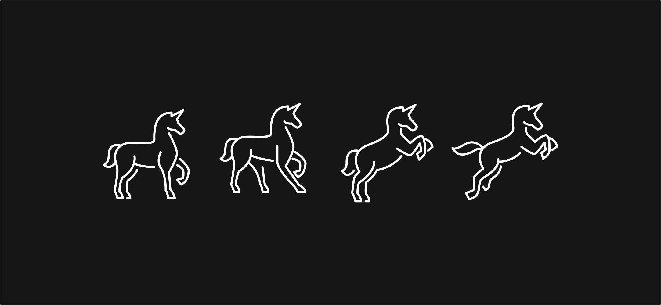
We set ourselves the constraint of using a unicorn for the visual identity, whilst keeping the brand modern and category-appropriate.
After lots of initial sketches during development, we decided to reveal the unicorn from within negative space, using black backgrounds to show the avatar without needing to be explicit. The Black Unicorn was always there, and the frame simply revealed it.
This allowed what was left to be filled with a holographic palette, carrying the rainbow colours Julija initially wanted but in a way that now reads as contemporary rather than generic and childish, which is so often associated with unicorns.
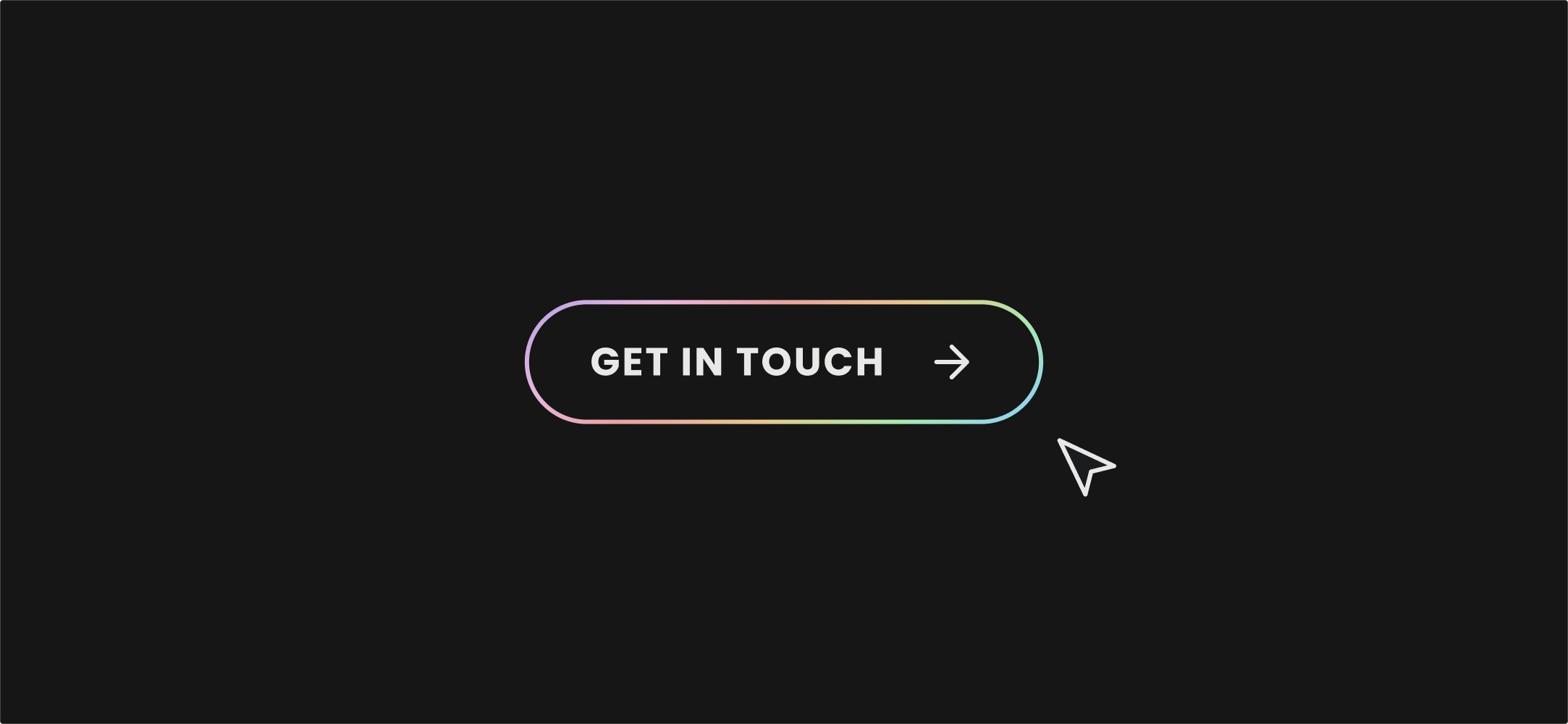
The brand system was built around that mark. Holographic accents across the brand language - social assets, website buttons, presentation elements, infographics. Black is always the primary background. Type and tone are confident, modern, and journalistic rather than corporate.
The identity was trademarked, and in the years since, it's had to be defended against multiple attempts at imitation. It’s the cleanest test of an ownable mark. People only copy what's working.
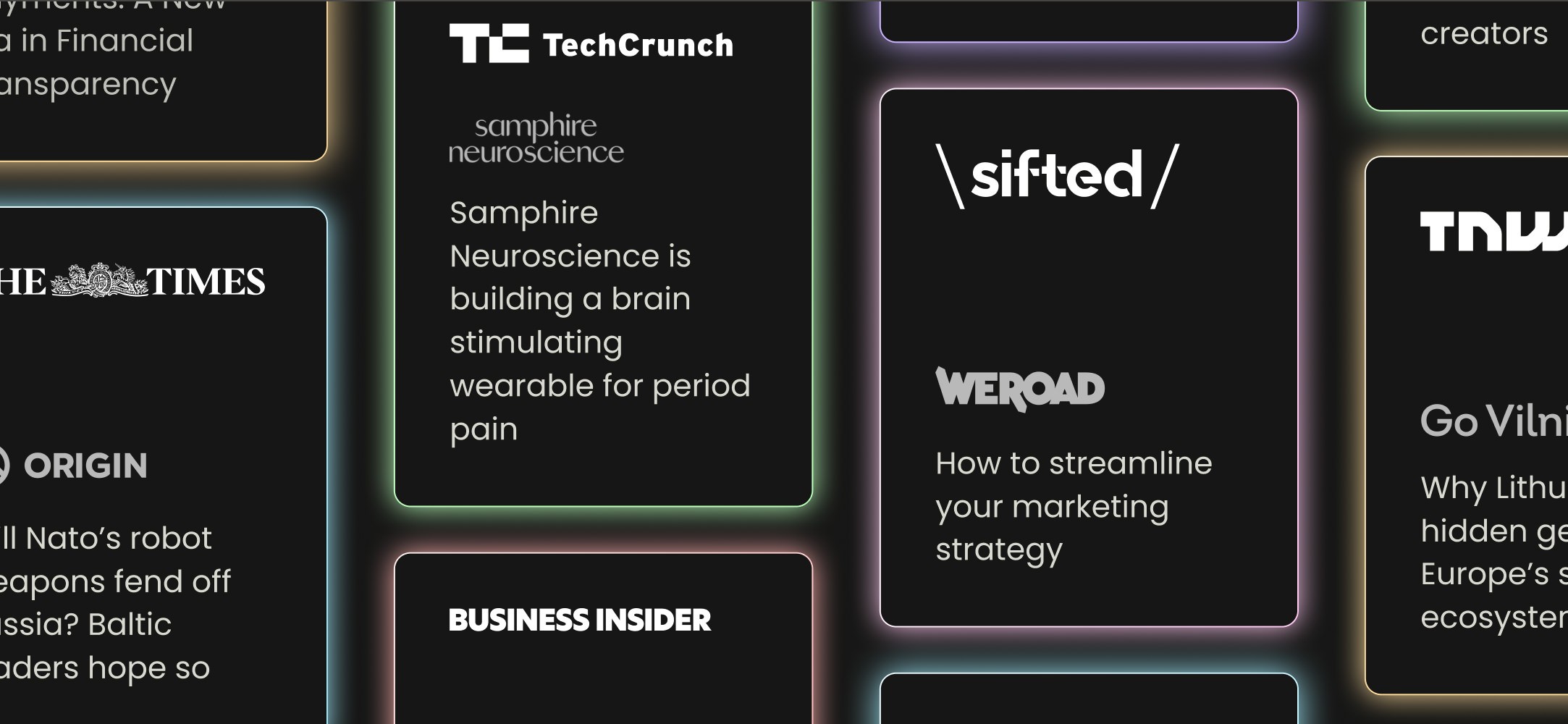
Five years in, the business had grown to house bigger clients and bigger placements. A track record that included Bloomberg, Reuters, BBC, Financial Times, TechCrunch, TechChill. Clients across InsurTech, HealthTech, MedTech, VC funds, and a thread of mission-led organisations. Black Unicorn had grown significantly, and we agreed that the identity needed to be revisited.
As often turns out to be the right choice, the strategic decision was a brand evolution. The original mark had four or five years of brand equity behind it, and a rebrand would have been a mistake.
Colours were intensified to lean further into the tech positioning, and across the brand, the system was sharpened. The mark stayed. The brand grew up without losing what had made it recognisable. Most agencies use a milestone like moving up-market as an excuse to rebrand from scratch, but Black Unicorn didn't need that.

The System
The original site we built when Black Unicorn first launched was a clear this is what we do shop window for founders looking to find the agency and start a conversation. It did its job for the stage the business was at.
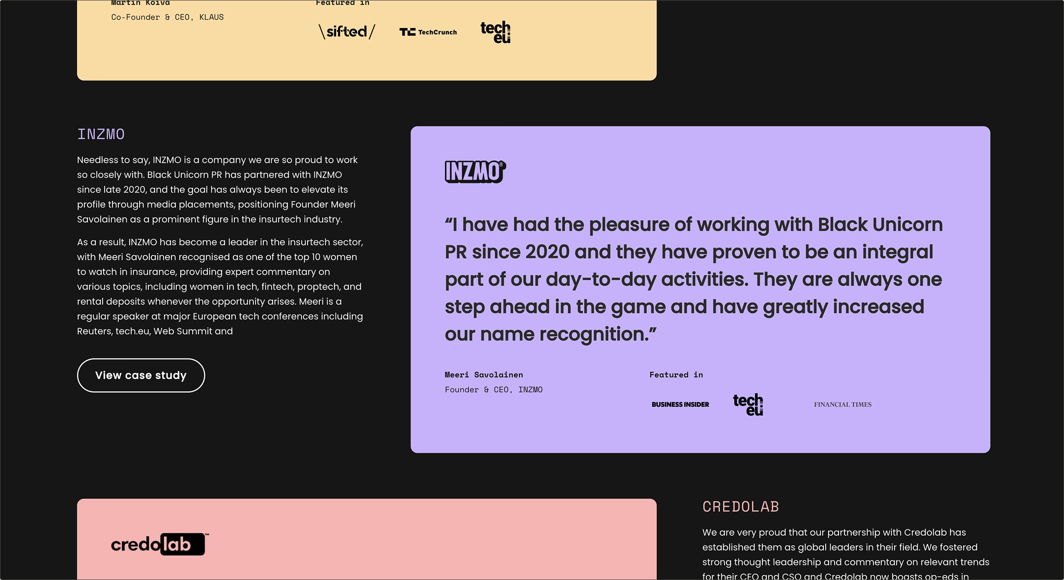
The current site is doing different work. It features case studies throughout, delivers social proof, professional accreditations and a regularly updated and categorised blog that gives the agency a permanent home for thought leadership and gives readers a reason to keep coming back. It’s currently boasting over 60,000 impressions a month without paid ads or seo retainers.
Black Unicorn don’t need to claim expertise simply because they can show it. A founder visiting the site has the evidence that Black Unicorn can get them into the publications that matter.
The brand works across two audiences without contradicting itself. Black Unicorn has to look like an agency journalists want to work with and an agency founders want to hire, so we make sure the brand system works for both.

This partnership has spanned over 8 years. From the original visual identity which has remained largely unchanged, we have delivered two websites as the business grew and ongoing digital projects, campaigns and brand assets.
This is a partnership that has stretched across all Black Unicorn's growth, from established-but-under-presented through to a recognisable senior player in the tech-PR space.
And Julija and Mauro have directly attributed the agency's growth to strong brand positioning.