Enter password to view case study
Giving a 360° wellness provider a 360° brand
Client
Body Unity
Sector
Health and Wellness
A wellness category built on singular fixes needed a brand built on continuity, and an honesty earned from years of watching the same patients come back for the same problems.
Brand Strategy
Creative Direction
Visual Identity
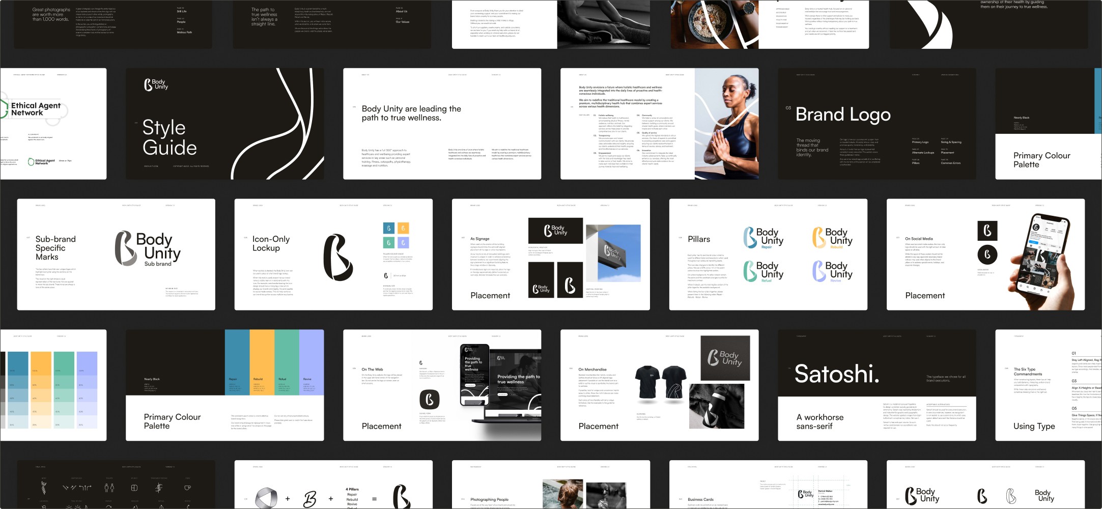
Style Guide
Pat and Has had spent years as osteopaths watching the same pattern repeat. A patient would come in. The treatment would work. Six to eight weeks later, the same patient would be back with a version of the same problem. Not because the osteopathy had failed, but because the rest of their life hadn't moved. No nutritional support. No strength work. No one looking at the whole picture.
The Body Mechanic, their existing practice, was built to do one thing well, and it did. But "one thing well" was the ceiling. Pat and Hass had spent too long in the industry to keep promising fixes they knew weren't fixes. They were ready to build something that could actually carry the weight of long-term wellness, not patch it weekly.
The shift was operational and strategic at once. A new space. Practitioner rooms, rehab rooms, personal training, massage. Nutritional therapists, physiotherapists, and mental health support. The full discipline set under one roof. The Body Mechanic name had served them at the osteopathic level, but it was masculine, mechanical, and pointed at a single trade. The new business needed a brand that pointed at the audience, not the practice.
Pat and Hass had already named it Body Unity and sketched a working logo when they called Contour. The name was theirs. The strategy underneath it wasn't sharp yet, and the workshops that followed pulled the positioning off "multi-disciplinary health centre" and onto something the audience could actually feel.
"Beyond the visual identity, they crafted a brand narrative that aligned with our vision and values. Contour has truly brought our theory to life. The workshops helped us examine our strategy thoroughly, pivot where necessary, and rethink our goals."
Has Hussain, co-founder
The wellness category sells fixes. Do this one thing and it'll solve it. One treatment, one supplement, one programme, one practitioner. The promise is singular because singular sells. Singular is also the reason patients keep coming back to the same problem.
At the other end of the market, the bigger multi-disciplinary players like Nuffield Health offer the breadth, but at a scale where the patient becomes a file. Bounced between specialists. No through-line. The continuity the model implies on paper rarely shows up in the room.
And visually, the category has agreed on what it looks like. Body silhouettes. Anatomical line drawings. Clinical blues. Stock photography pointing at body parts. One identity could swap with another and no one would notice.
What the audience actually wants, and what most of them have already failed to find before they walk through the door, is someone honest enough to tell them the truth. There's no one treatment. Progress isn't linear. The only way through is a team that talks to each other and stays with you long enough to see results.
The strategic position became: 360-degree wellness, walked through with you, from people who've watched the singular-fix promise fail too many times to keep selling it. Not multi-disciplinary. That's the category's word, and it talks to practitioners. 360-degree, because that's the experience the patient is actually paying for.
Animation by Tobias Anderssohn
The Identity
Every visual decision had to argue for continuity over fragmentation, and for ownership of a category that had stopped trying to look distinct.
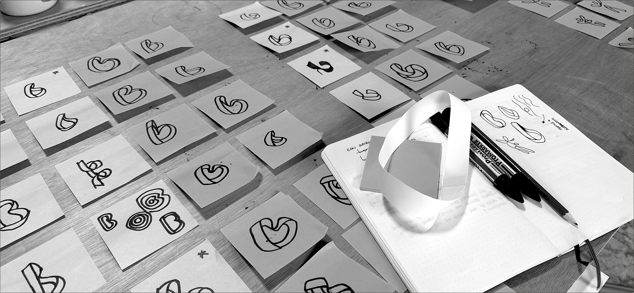
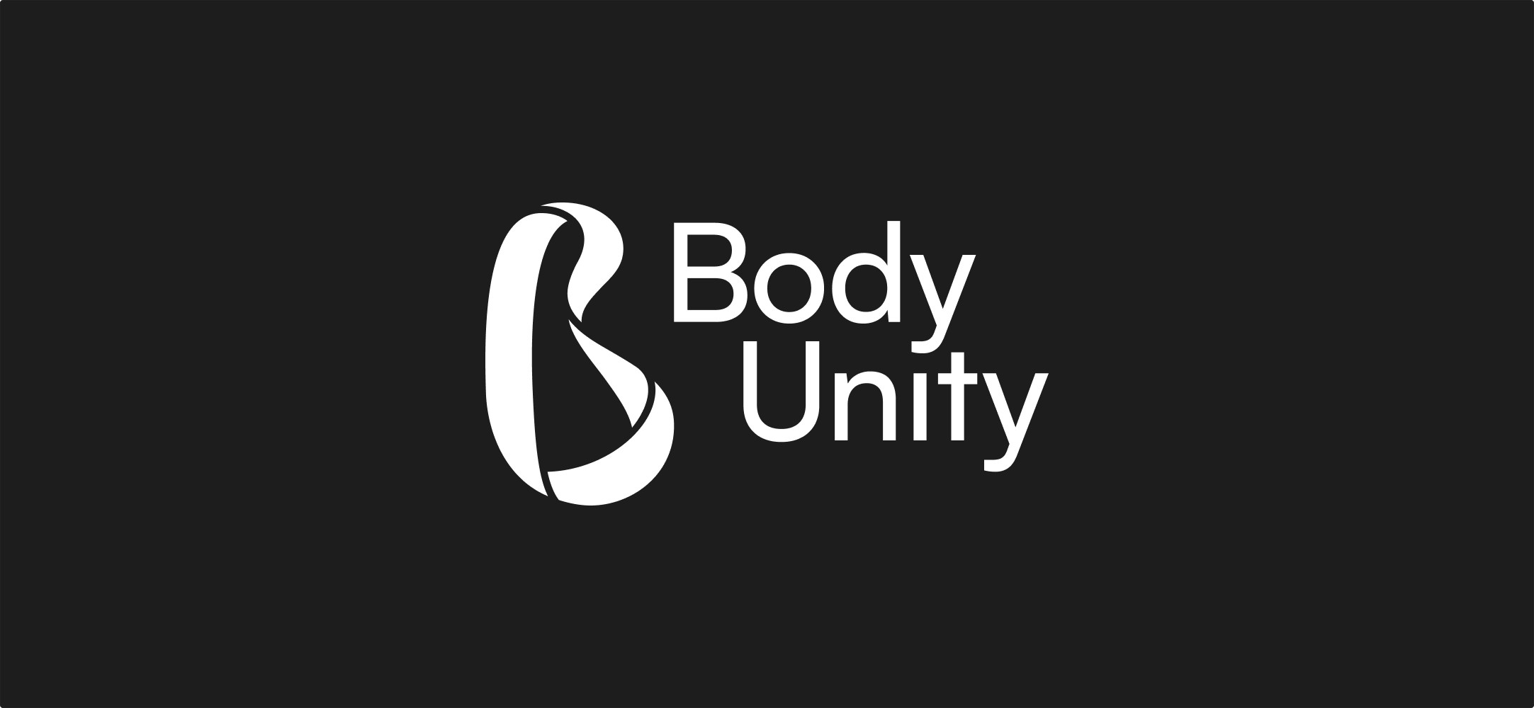
The Möbius-as-wordmark. The logo is a Möbius loop drawn in the shape of AB. A Möbius has one continuous surface. Trace your finger across it and you cover every side without ever lifting off. That property is the brand argument made geometrically. Nothing gets handed off. Nothing gets missed. The disciplines aren't bolted together, they're one surface. A circle would have said holistic. An infinity loop would have said ongoing. The Möbius says continuous, and every side is the same side. That's the only shape that makes the strategic claim visible.
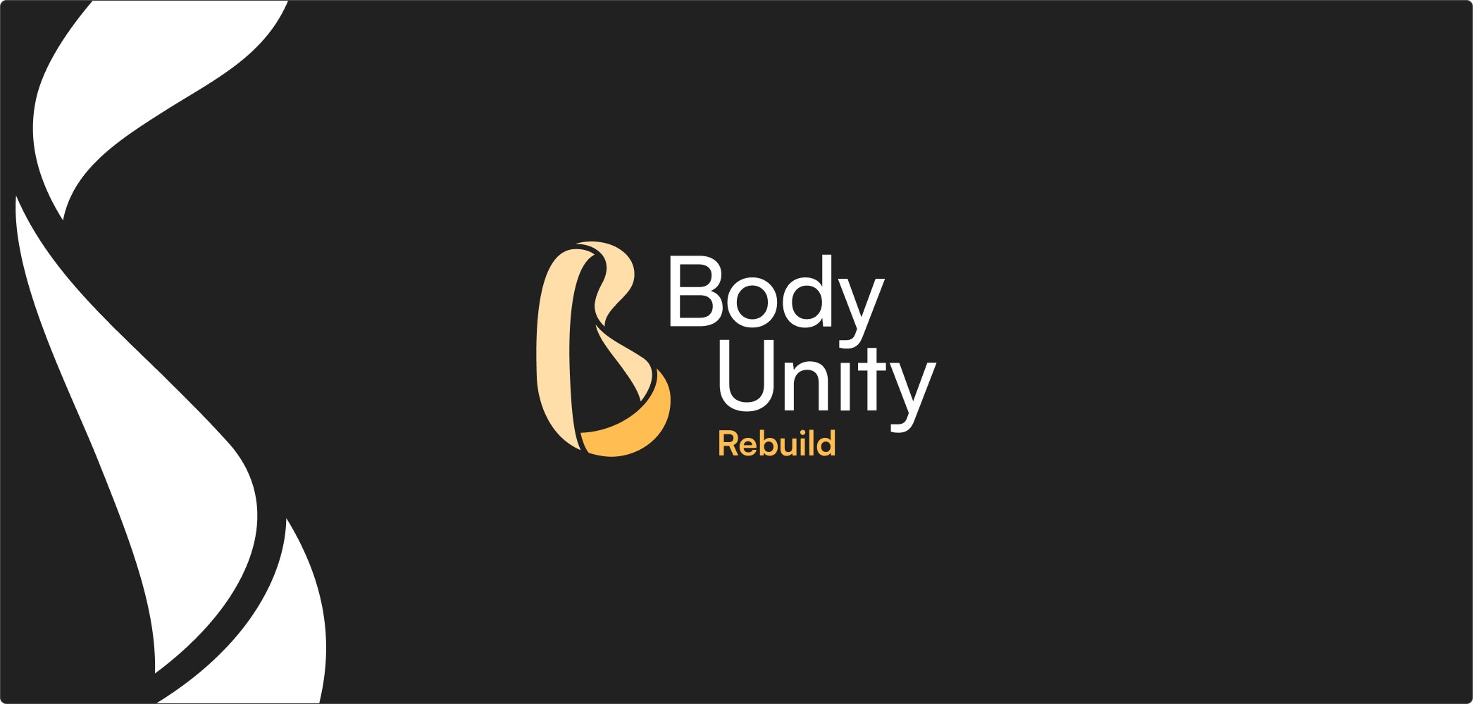
The four-part B. The B is split into four sections: Repair, Rebuild, Refuel, Revive. The four founding pillars of how Body Unity actually works. The split makes the system legible inside the icon itself. One continuous surface, four disciplines doing distinct work. The architecture is the argument.
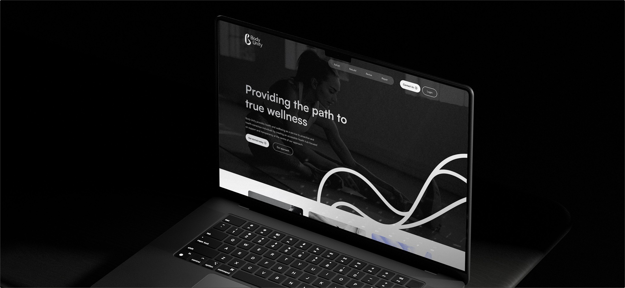
A 2D mark with 3D execution. The wordmark reads flat, but the Möbius is rendered with the depth of an object that exists in space. The brand isn't an idea pinned to a wall, it's a place patients move through. Animation extends the same logic. The mark moves because the journey moves. Static would have undercut the entire premise.
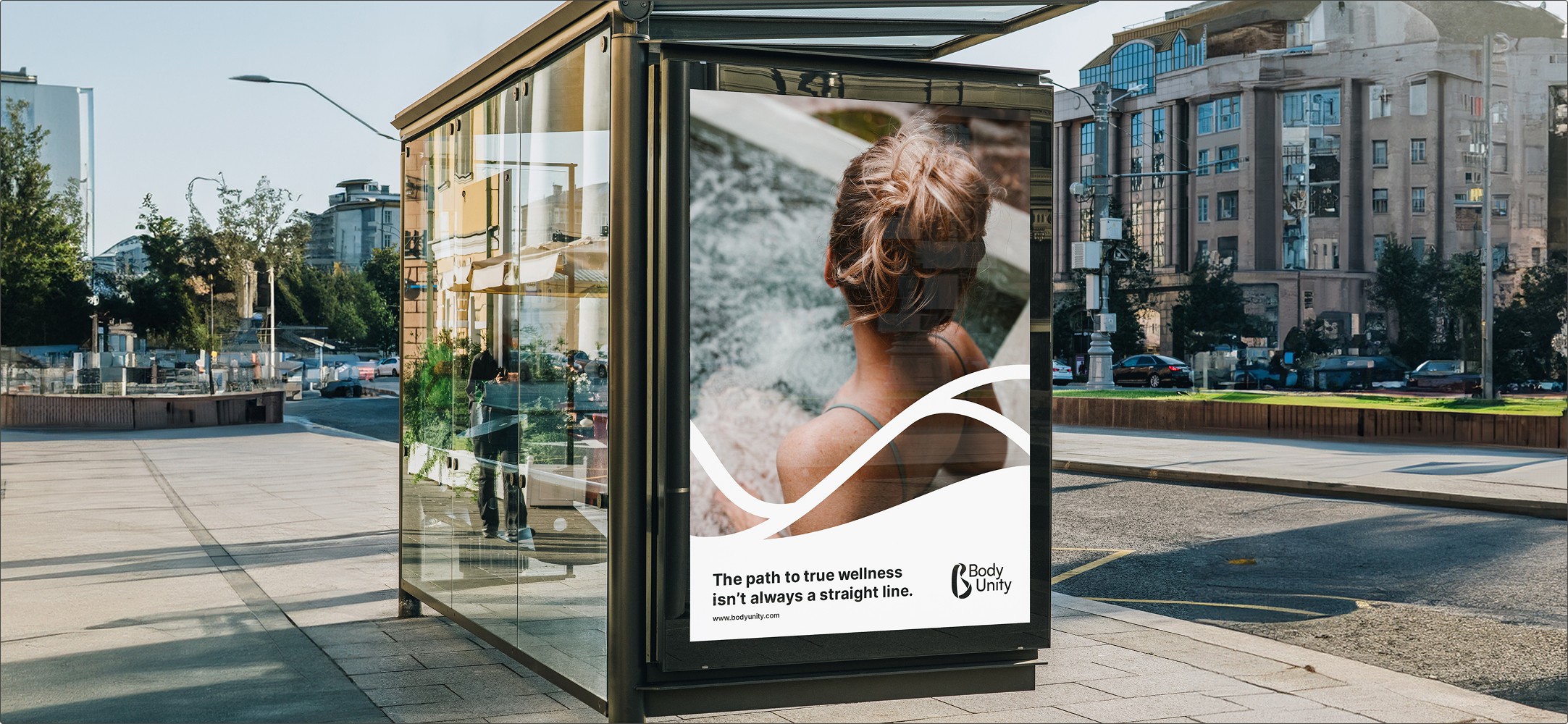
Photography that points at the patient, not the body part. The category default is anatomical. A knee, a spine, a hand on a shoulder. Body Unity's image world is the opposite. Real people in motion. Athletes mid-effort. Individuals at their own stage of progress. The brand looks at whose body it is, not what part hurts.
Tone of voice that names the lie. The path to true wellness isn't always a straight line. The line works because it's pushing back against the specific promise the rest of the category is making. It's not a tagline about the brand. It's a correction to what the audience has been told everywhere else.

The System
Body Unity had to talk to athletes, sports enthusiasts, working professionals, the elderly, the young. Anyone who'd been around the block on the singular-fix promise and was ready for something more honest. The brand system is built for that range without diluting the centre.
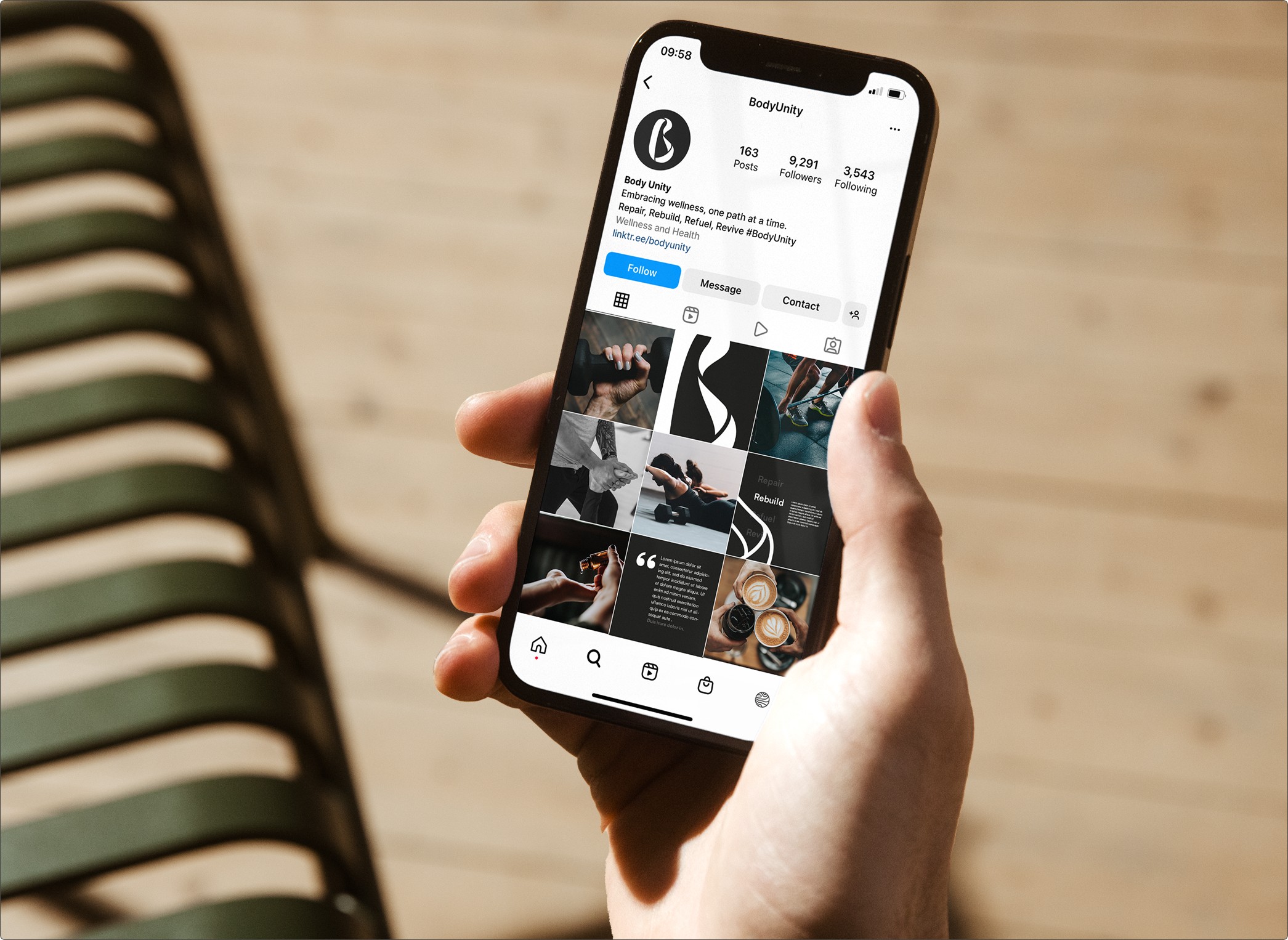
The Möbius holds across every touchpoint. The four-pillar B (Repair, Rebuild, Refuel, Revive) lets each discipline get its own focused expression without breaking the parent identity. Colour, motion and tone flex. The architecture doesn't.
The system was designed so Body Unity could keep stretching as the practice grew, without ever needing to be re-explained.
Brand strategy. Visual identity. Brand guidelines. Colour system. Design system. Motion principles. Tone of voice and messaging architecture.
The deliverables matter less than what they unlock. A practice that can now show up the way Pat and Hass have always practised. Fully, honestly, and across the whole person.
Body Unity is the honest answer to a category that keeps selling fixes. 360-degree wellness that doesn't bounce patients between specialists, doesn't promise the singular treatment, and doesn't pretend the path is straight. One continuous surface. Four pillars. Two founders who spent long enough watching patients return to know the work has to be bigger than any one of them.